

















How Creative Packaging Solutions Help CPG Brands Stand Out

Walk into any supermarket, convenience store, or specialty shop and you’ll see the problem pretty quickly. There are hundreds of products fighting for a few seconds of attention. A customer may never read the full label or compare every feature. They notice the package first. That is where Custom packaging design starts doing some real work. It gives a product a visual identity before anyone has tried it. Good packaging can make something feel premium, practical, fresh, bold, or completely different from the box sitting beside it. And honestly, that first impression matters more than brands sometimes want to admit. If the package looks forgettable, the product can get ignored even when what’s inside is actually pretty good.
Packaging Can Turn Recognition Into Brand Memory
A strong package is not just about looking attractive on a shelf. It should help people remember the brand after they’ve walked away. Think about the colors, typography, shape, imagery, materials, and little visual details that become associated with a product over time. When those elements work together, customers can often recognize a product without even reading the name. That kind of recognition is valuable for CPG brands because buying decisions are often quick. People already know what they like, and familiar visual cues can make choosing easier. Packaging also gives newer brands a chance to build that familiarity from scratch. It doesn't need to scream for attention. Sometimes a clear, confident design gets noticed because everything around it is trying too hard.
Creative Structures Make Products Feel Different
Sometimes the biggest opportunity is not printed graphics at all. It is the physical package. A different box shape, an unusual bottle, a smart closure, a textured surface, or packaging that opens in an unexpected way can change how customers experience a product. These choices can also make a product easier to use, which is something brands shouldn't overlook. Nobody wants packaging that looks amazing but is a nightmare to open. Creative packaging needs to balance appearance with function. It should protect the product, survive transportation, fit retail requirements, and still feel interesting when somebody picks it up. That balance is where thoughtful packaging development earns its keep, instead of just becoming another design exercise.
Materials Can Tell a Bigger Brand Story
Consumers notice packaging materials more than they used to, especially when sustainability is part of the conversation. Recyclable paperboard, reduced plastic, reusable containers, lightweight materials, and simpler structures can all affect how a product is perceived. But brands need to be careful here. Slapping an “eco-friendly” message on a package doesn't automatically make the packaging responsible. The actual material choices and production process need to support the claim. There is a practical side too. Sustainable materials can sometimes create a distinctive visual or tactile quality that helps a product stand apart. A natural finish, rough paper texture, or minimal print treatment can communicate something before the customer reads a single word.
Design Should Match the People Buying the Product
A package can be beautifully designed and still miss the mark if it doesn't connect with the intended audience. Packaging for a family-focused food product will probably communicate differently from packaging for a luxury beverage, skincare product, supplement, or niche lifestyle item. That doesn't mean every brand needs to follow stereotypes. Quite the opposite. Good consumer packaging understands what the audience expects and then finds a smarter way to work within, or push against, those expectations. Research helps, but so does common sense. Look at where the product will be sold, who is picking it up, what competing products look like, and what the customer needs to understand quickly. Design choices should have a reason behind them.
Packaging Helps New Products Compete With Established Names
Big CPG companies already have recognition on their side. Smaller brands usually don't. Packaging can help narrow that gap by making a new product look confident and considered from day one. A strong visual system gives the brand something consistent to build around across bottles, cartons, pouches, labels, shipping boxes, and digital channels. That consistency matters because customers may first see a product online and later encounter it in a store. If it looks completely different in each place, recognition gets lost. Creative packaging gives smaller companies a way to establish credibility without pretending to be something they're not. It can make a young brand feel ready for the shelf.
Packaging Trends Are Changing, But Clarity Still Wins
There will always be new packaging trends. Bold typography, minimalist labels, nostalgic visuals, unusual illustrations, transparent materials, tactile finishes, and limited-edition designs all come and go. Brands can use those ideas, but chasing every trend isn't really a strategy. A package still needs to communicate what the product is and why somebody should care. If a customer can't figure that out quickly, clever design has become a problem. This is especially important when packaging has legal information, ingredients, usage instructions, or product claims that need to remain readable. Creative doesn't have to mean complicated. In fact, some of the strongest packaging is pretty simple once you look closely.
Different Industries Need Different Visual Thinking
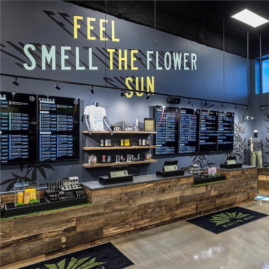
There isn't one formula that works across every consumer category. A beverage brand might rely heavily on color, bottle shape, and shelf presence. A food product may need appetite appeal and clear product photography. Beauty packaging often leans more heavily on texture, typography, and premium finishes. In emerging categories, design can also help establish what the category represents to consumers. This is one reason Cannabis brand design needs more thought than simply putting a leaf on a label. The visual identity needs to communicate the brand's personality while also working within packaging requirements, audience expectations, and a crowded marketplace. The same basic principle applies across CPG: design should make the product recognizable without making it confusing.
The Best Packaging Connects Design With the Actual Product
Creative packaging works best when it feels connected to what is inside. If the package promises premium quality but feels cheap, customers notice. If it looks playful but the product experience is serious and clinical, there can be a disconnect. The package sets an expectation, and the product has to meet it. That is why packaging design should involve more than picking colors and fonts. Brand positioning, product characteristics, retail environment, manufacturing realities, and customer behavior all play a role. When those pieces line up, the package becomes part of the overall product experience rather than decoration added at the end.
A Strong Package Gives Customers a Reason to Look Twice
In crowded CPG categories, getting noticed is only the beginning. The package needs to create enough interest for someone to pick it up, understand it, and remember it. That might happen through a striking visual, a useful structural feature, a clever detail, or simply a much clearer presentation than competitors are offering. There is no magic trick here. The strongest packaging usually comes from understanding the product and the customer, then making deliberate choices instead of throwing design ideas at the wall. When done properly, creative packaging can support recognition, communicate value, improve usability, and give a CPG brand a stronger presence every time its product hits the shelf.
What's Your Reaction?
 Like
0
 Dislike
0
 Love
0
 Funny
0
 Angry
0
 Sad
0
 Wow
0